
Ann Diener & Joseph Stashkevetch
“How and Why”
For my second critique, I chose my artists based on Linda’s advice of “how and why”, and I think these questions applied to both of my artist have some interesting answers. Both artists use media that I am not familiar with (except graphite), and both use more than one type of media in their compositions, and the media has evolved over time. For example, Stashkevetch incorporates watercolor in some of his drawings, and it is scattered throughout his collections and time.
Joseph Stashkevetch
Joseph Stashkevetch – Born 1958, New Jersey – Lives and works in New York http://www.stashkevetch.com/
“Common theme of accumulation and decay” – Artsy.com
“Velvety and moody hyperrealistic drawings” – Von Lintel Gallery, L.A.

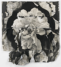
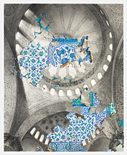
Joseph Stashkevetch chosen work: Bayon #2 60×60 conte crayon on paper – 2007
How is the work made?
In this drawing, Stashkevetch uses paper and conte crayon.
What are the formal elements of the artwork?
Stashkevetch uses tone, shape and pattern in this realistic drawing of the temples in Bayon in Cambodia. The use of tone (throughout most of his works) is what captures his work as being so realistic. The pattern in the stones, of the carvings and the lichen formations and the detailed work in the foreground speak to the immense size of the temples (the tone is grayer and less detailed at the top). The tone is also representative of the light and shadow – the face on the left, the crevaces and the shadow behind the columns is very pronounced.
What is the context of the work?
Stashkevetch drew the Kampuchea series based on a trip he made to Cambodia some years before.
Describe the content/subject of the work.
The work is said to deal with the rise and fall of civilizations within Cambodia, and the process of change. (Shultz Gallery, 2007)
Bayon is a buddhist temple in Angkor Thom built around the 12th century by Jayavarman VII. It has 54 towers, and 212 massive smiling faces, of which you can see one in this drawing in the shadow. (Lonely Planet)
The scale of the drawing, and the fact that the top of the tower isn’t even included, speaks to the immense change and decay of the temple.
What is the mood of the work?
The mood is introspective, and I feel like I need to learn more about the culture that created the temple. The atmosphere created by the dying light (the shadow) somehow makes it look like the tower and face is going to sleep, and that more change and decay will come tomorrow. I find it a little sad, but interesting too.
How might their work inspire me?
Bayon #2 brought me to look at the artists newer works, and use of texture, and I am really interested in texture myself. I see it everywhere, and this is why I began my exploration of art with paining furniture – I loved the built in texture and that I could create more texture with clay paint. I am looking forward to creating a work with layered paper. I am also really interested in capturing texture with photos when I learn more about photography, and transferring it into digital backgrounds.
Ann Diener
Lives and works in Santa Barbara – anndienerstudio.com
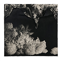
14×16 in graphite, Prismacolor, gouache, ink & cut paper on paper – 2011
14 x 16 in graphite, Prismacolor, gouache, ink, oil, cut paper on paper – 2011
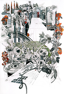
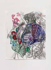


Ann Diener – Chosen Work: Cathedral #3
How is the work made?
Diener uses a few different types of media in Cathedral #3, including Prismacolor pencils, graphite pencil, gouache (a water-soluble paint), ink, oil, and cut paper on paper. Gouache is more matte and opaque than watercolor, and by using these different types of media with different opacities, Diener achieves the layering of the elements which helps with the proportions of the work. It is difficult to see detail in the online photos of her work.
What are the formal elements of the artwork?
Diener uses line, shape, color, texture and space in her work. In Cathedral #3, the curved lines suggest movement and are used in some of the more organic shapes, whereas the vertical lines are suggestive of the greenhouses which are the theme of this series. The vertical lines are also used to convey scale and space, and speak to the vast size of the structure. Diener uses repetition in the shape (and orange color) in the spherical objects placed throughout, some look like lamps, some like pumpkin tops, some are no more than dots in the distance. It is difficult to see if there is three dimensional texture to the work, although I assume it may be there because it indicates the media includes cut paper on paper. The 2 dimensional texture is seen in the shading mostly of the geometric shapes.
The illusion of 3 dimensional space is completed by the use of line, perspective techniques, shading, and as mentioned this is also accomplished by the layering of different types of media.
The shape of the spires in the distance creates curiosity and suggests other types of buildings; old churches, banks, museums.
What is the context of the work?
-Cathedral # 3 is part of a series of 10 drawings called “Cathedrals of Commerce” in 2008
-Large scale drawings describing the shifting “the shifting landscape of agriculture through successive generations” (Edward Cella Art & Architecture)
-The work relates to the changing of the Californian landscape where Ann Diener was raised
-The work(s) depict massive, modern greenhouse operations
Describe the subject/content of the work.
“Cathedrals of Commerce” is an attempt to reconcile Diener’s memories of childhood in rural California with the modern agricultural industry of today
-The greenhouses are depicted as sprawling and towering, with images of other historical buildings (note the curious spires in the distance)
-This series, along with others, has the ongoing theme of change and growth in the agricultural industry
What is the mood of the work?
Cathedral #3 makes me feel hopeful that modern industry may solve worldwide hunger, but at the same time depressed that it seems so at odds with nature.
-The repeating elements (coils, ropes/wires, organic elements) confuse me a bit, but the hopeful color of orange interspersed throughout unifies the composition
-The mood is busy but at the same time, it creates emptiness without human form
-The repeating elements are something I would like to try in my own drawing, and I have recently tried in my graphic design class. It makes the viewer curious as to the significance of the elements.
Similarities and difference between the two artists
- Both use more than one type of media in their work
- Both skillfully use tone (but with different media) to emphasize scale
- Both have produced large scale drawings, and incorporate 3 dimensions within their work
- Both have created many series of work in their careers, changing and adding different media over time
- Both document the process of change/decay/monumental works in the world
- Dieners work is both abstract and realistic within one composition
- Stashkevetch’s work is both hyperrealistic and photo realistic, and although some of the elements in Dieners work are realistic, they are verging on representational.
- Diener uses more color in her work than Stashkevetch